Resources for visualisation
Here we list tips on resources that can facilitate visualisation work, inspire and provide new ideas, offer a way forward for skills development or involvement in a larger context.
This list with examples of tools, literature and tips is updated regularly. Please feel free to contribute tips and suggestions for resources that may be useful to others.
Choosing the right chart
Sometimes it can be difficult to know which kind of visualisation is the best fit for a specific data set, and which chart clearly communicates your findings. Below we list some resources that may help you:
Software and applications
Below you will find examples of applications that may be suitable to use when visualising data. They are either available per licence through KI or freely available.
Affinity
Professional design software suite for graphic production, which includes Affinity Photo, Affinity Publisher and Affinity Designer. Affinity Designer has similar functionality as Adobe Illustrator.
- KI gives students (Bachelor/Master) access to the Affinity suite. Read more about how to get access to Affinity as a student.
- If you are employed at KI (doctoral students and staff) and is interested in Affinity, order a license via KI's software catalog.
Blender
Blender is a powerful program for the production of 3D graphics, whether for modelling, animation or rendering. Blender is freely available and many user guides and tutorials for Blender are available.
There is also a freely available add-on, Bioblender, which focuses on the visualisation of proteins and macromolecules using PDB data. However, the software package is no longer updated.
Excel (Microsoft 365)
Access to Microsoft 365 as a student or employee at KI makes MS Excel a standard application in the visualisation toolbox. Excel is suitable for visualisation, especially when dealing with data sets of limited size. Several detailed user guides are available:
- Brief visualisation guide for Excel from Duke University Libraries
- Comprehensive guide for more advanced visualisation in Excel from PolicyViz.
Gephi
Gephi is a freely available program for network visualisation and analysis. User guides for Gephi are offered for both beginners and more advanced users.
GIMP
A free alternative to Affinity Photo and Adobe Photoshop for image editing. GIMP is open source and has many useful plug-ins, often developed by other users. For example, the colour converter Jet Killer, released under an MIT licence. Comprehensive user guides for GIMP are available.
Inkscape
A free, open source, alternative to Affinity Designer and Adobe Illustrator, Inkscape lets you work with vector graphics. Many user guides for Inkscape are available.
Krita
Krita is an application that allows the user to produce high quality professional illustrations. Like GIMP, it is a free alternative to licensed software such as Affinity Photo and Adobe Photoshop. The focus is on the creation of digital images, rather than on editing. The application works on Windows, macOS and Linux, as well as Android and Chrome OS. Documentation includes both user manuals and tutorials.
Maya and mMaya
Autodesk gives students and teachers free access to the powerful 3D software Maya, after registration.
If you then create a free user account with Clarafi, you can download the free Molecular Maya (mMaya) plugin, which allows you to produce advanced 3D visualisations of PDB data.
Molecular visualisation
This is a list of useful applications for molecular visualisation, each with slightly different features:
- Cn3D, a freely available tool from NLM. Loads files from the Molecular Modelling Database (MMDB), files based on PDB data. However, since the tool is being phased out, they recommend the web-based application iCn3D instead.
- Jmol, an open source Java-based application. Also available as JSmol, a javascript version that allows full HTML5 integration, including interactivity. User guides and information on proper citation are available.
- PyMOL is available both as a licensed product and freely available as open source code. The application is python-based.
- UCSF ChimeraX, free to use for non-commercial purposes, a powerful application that offers many advanced features for both exploratory and descriptive visualisations. User guides are offered, as well as support for VR projection and 3D printing. There is also information on how to cite the tool properly.
- VMD, or Visual Molecular Dynamics, is a freely available open source application. Good user support is provided in guides and manuals.
PowerPoint (Microsoft 365)
PowerPoint, a part of Microsoft 365 that you as a student or employee at Karolinska Institutet have access to. A powerful tool for presentations.
If you need help getting started with the software, Microsoft provides several basic user guides for PowerPoint.
RAWGraphs
RAWGraphs is an open source web-based visualisation tool. It is suitable for use in the step from spreadsheet programs (e.g. Microsoft Excel, Apple Numbers, OpenRefine) to vector-based illustration programs (e.g. Adobe Illustrator, Inkscape, Affinity Designer).
You upload your data, select graph and then export graphics for further post-processing. No registration is required, it is free to use, and no data is saved or stored. Educational user guides describe how to create the various charts and graphs, and there is clear information on how to cite the tool.
Visual abstracts
These are some online resources that may be useful when producing visual abstracts (also called graphical abstracts):
- BioRender is a service that makes it easier to create graphical abstracts and illustrations. How to order BioRender if you work at KI.
- Mind the graph has tens of thousands of icons and illustrations suitable for scientific communication in medicine and biology.
- The noun project offers many thousands of icons, illustrations and images in several different disciplines.
- Bioicons offers an extensive collection of icons relevant to medicine and biology, the vast majority under free licence.
Read more on our page on how to communicate your research using graphical abstracts.
Literature
Books on visualisation
The books on the subject of visualisation listed here should be seen as both in-depth and complementary material. Above all, they complement each other, but each offers an in-depth study of a particular approach or tradition of thought. The list is by no means exhaustive or complete; rather, it consists of literature that discusses and describes visualisation from both an exploratory and an explanatory perspective.
Tamara Munzner Visualization Analysis and Design, 2015, ISBN: 9781466508910.
Theoretical and practical holistic approach to the visualisation process. Function before form. Excellent book regardless of knowledge level. If you only have time to read one book from the list, this one is recommended. The book is available via the library.
Colin Ware Information visualisation : perception for design, 2012, ISBN: 9780123814647.
Describes visualisation as a natural part of the research process. Attaches great importance to human perception. Clearly rooted in science and proven research. Excellent in-depth literature.
Colin Ware Visual thinking for design, 2008, ISBN: 0123708966.
Describes visual coding in detail, focusing on human perception and why some visual signals are more effective than others. Provides an understanding of basic graphic principles. The book is available via the library.
Edward Tufte The visual display of quantitative information, 2001, ISBN: 0961392142.
Deals with graphic presentation of statistical data. Clarity and readability are central. Sparse expression, emphasis on presentation of data rather than embellishment. Function over form. Inspires restraint. The book is available via the library.
Edward Tufte Envisioning information, 1990, ISBN: 0961392118.
Inspiring compendium of restrained visualisations and intelligent design solutions, for example the concept of "small multiples" is presented in more detail. Good extension literature.
Charles D. Hansen & Chris R. Johnson (ed.) The visualisation handbook, 2014, ISBN: 012387582X.
An anthology that provides a good introduction to the field. Covers both the technical and the perceptual aspects.
Jeff Johnson Designing with the mind in mind : simple guide to understanding user interface design rules, 2014. ISBN: 9780124079144.
Focus on user-tool interaction, interactivity and accessible design. Technically oriented literature suitable for consultation when designing interactive visualisations. The book is available via the library.
Claus O. Wilke Fundamentals of data visualisation, 2019, ISBN: 1492031089.
Provides a broad introduction to data visualisation. Practically orientated book, full of tips and guidelines. A preprint of this book is available online.
Martin Engebretsen & Helen Kennedy Data visualisation in society, 2020 ISBN: 9789463722902.
A multidisciplinary perspective on visualisation and its application in society. This is an open access book available online.
Conferences
Attending a conference can be a great way to network, keep track of new trends, new programmes and tools, and stimulate collaborative and developmental work.
- VIZBI, or Visualizing biological data, is a three-day conference held annually since 2010. The focus is on visualisation in biomedicine, from the nanoscale and molecular level up to populations and ecosystems. Every other year it is held at EMBL in Heidelberg and every other year elsewhere in the world, usually in the USA. Usually has good opportunities for digital participation. Mixes and brings together academia and industry.
- Outlier is a conference organised by the Data Visualization Society. The first edition was held in 2021. An online conference with activity for most of the day, where presentations follow each other according to time zones. The concept of visualisation is broad and the content is generous. Great emphasis is placed on accessibility and inclusion.
- IEEEvis is an established and technically oriented visualisation conference organised since 1996. The focus is on both theory and methodology. The conference mixes and brings together academia and industry
Podcasts
There are many podcasts about visualisation, but not all of them discuss in depth various key aspects of the topic. We list some of the ones that tend to keep a high level of content below. They are not ranked, but presented in alphabetical order:
- Data Stories is a podcast made by Moritz Stefaner and Enrico Bertini. The podcast is grassroots funded and free of commercial elements. The episodes are in-depth and the discussions are wide-ranging, covering both broad, general issues and narrower, more specialised topics. If you want to immerse yourself in the topic of visualisation, but only have time for one podcast, Data Stories is the one to focus on.
- Data Viz Today is hosted by data analyst and designer Alli Torban. Torban talks to renowned guests about the visualisation process, often from a communication perspective and often with a design focus. There are also a lot of short episodes with tips and tricks, little things that can be useful to think about.
- Explore Explain is produced by Andy Kirk from Visualising Data. Each episode is based on a given visualisation where Kirk talks to the creator about both the process and the production. The episodes tend to detail all the possible steps in the work process, all the big and small decisions made along the way, and the various unexpected and imagined problems that may arise.
- Storytelling with Data is the podcast that emerged from a broader initiative focusing on the communicative component and storytelling in visualisation. The initiator is Cole Nussbaumer Knaflic and even though the perspective originally comes from the business world, there is a lot of interesting information to be found for scientific communication as well.
- The PolicyViz Podcast is hosted by economist Jonathan Schwabish from PolicyViz. Here, too, the focus is on communication, with much consideration given to the market and the recipient. The content is skewed towards data journalism rather than medicine and biology, but important angles such as accessibility and inclusion are given a lot of space and some episodes deal with more technically orientated topics, such as human-computer interaction.
- The Data Wranglers is a podcast that takes a data engineering and, to some extent, a data science perspective. The topic of visualisation is a recurring one and one that is close to the hearts of authors Joe Hellerstein and Jeffrey Heer. Even if visualisation is not always the focus, data design is closely related to the perspective on data science offered by The Data Wranglers.
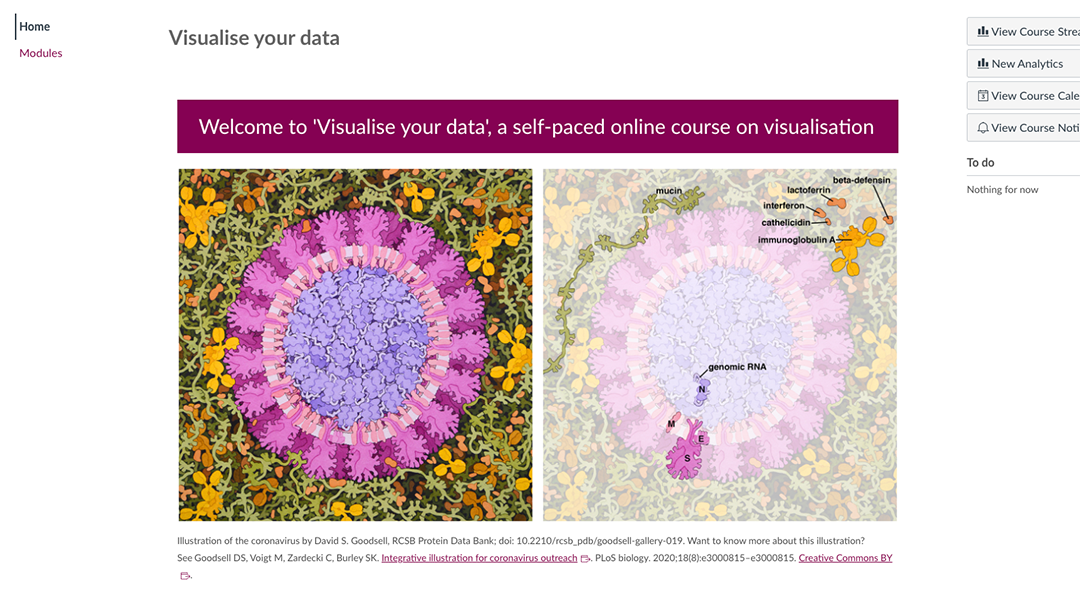
Self-paced course on visualisation
The University Library’s free, open online course on research data visualisation provides you with a basic introduction to the field. Through case studies and practical exercises, you will learn to graphically represent and communicate data in an effective and accessible way.

Om du vill att vi ska kontakta dig angående din feedback, var god ange dina kontaktuppgifter i formuläret nedan