Graphic principles
Understanding graphic principles and how human perception works is key to effective visualisation. The better we understand how the viewer perceives visual material, the better we can adapt the material we create.
Upcoming events about visualisation
- 2026-04-29 - 13:00
- 2026-05-07 - 12:15
- 2026-05-18 - 13:30
Visualisation is a powerful communicative tool. This is because visualisation leverages human perception, that is, our visual sense and the brain's ability to manage visual information, in order to interpret data easier, faster and better.
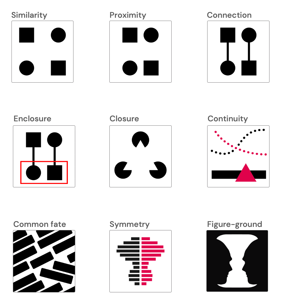
To better understand how humans perceive and order their environment, psychologists have formulated what are known as the Gestalt principles. These principles have been applied to many different aspects of graphic design, and how they are described and presented tends to differ from case to case. Nonetheless, the basic assumption is that humans perceive the whole of an image, or ’Gestalt’, as something different from what the individual parts might suggest on their own.
There are numerous Gestalt principles, and some are more relevant to the field of research data visualisation than others. In the module about graphic principles in the University Library's open online course about visualisation, you will learn about a selection of Gestalt principles that can help you communicate grouping and commonality more efficiently. For example, when designing visual content, you need to keep in mind that:
- We tend to consider objects that are similar in shape or size as belonging to the same group, and often performing the same function.
- We tend to consider objects placed near each other as belonging to the same group.
- We also tend to consider objects that are connected to one another, for instance by a line, as belonging to the same group.
- Enclosure is yet another a way of asserting commonality.
- Because it is possible to communicate information in several dimensions within a visualisation, it is also important to understand the relationship between figure and background in an image, and how these aspects interact.
Because humans are highly sensitive to deviations and irregularities in graphic material, Gestalt principles can function as powerful tools for focusing and directing a viewer's attention. By applying these principles in a thoughtful way it will be easier for you to create a clear visual reading order. This helps your audience 'navigate' your visualisation more easily, as it provides cues on
- how different components in your visualisation relate to each other,
- where they should look first, and,
- where they should look next.
Learn more

Self-paced course on visualisation
The University Library’s free, open online course on research data visualisation provides you with a basic introduction to the field. Through case studies and practical exercises, you will learn to graphically represent and communicate data in an effective and accessible way.

Contact the library
You are welcome to contact us through phone, chat or email.
Opening hours chat & phone
If you would like us to get back to you, please submit your contact information in the form below along with your feeback.

