To visualise a virus
These days we’re for obvious reasons communicating information about the ongoing pandemic both widely and broadly. Visually-oriented creatures that we are, images frequently accompany this information, clearly intended to entice us to further reading. Yet what kinds of images are these and what exactly are they communicating to us?
The virus SARS-CoV-2 belongs to the coronavirus family; appearance has in this case determined its name. Glycoproteins on the virion’s surface create a ring, gloria, or corona around the virus. These glycoprotein growths consist of S-proteins (s as in spike), one of a handful of different proteins of which the virus is comprised. Others include the M-protein (membrane), the E-protein (envelope or lipid envelope), the N-protein (nucleocapsid), and the virus’s genetic material, its genome, which is comprised of RNA.
Viruses are very small biological entities; virions in the corona family are no more than 120 and 160 nanometers (nm) in diameter. To put this in some sort of context we could compare the diameter of the corona virus to the diameter of a strand of hair, which is roughly between 75.000-100.000 nanometers.
The human visual system is sensitive to light, and the light the eye captures is electromagnetic radiation that occurs at a wavelength approximately 300-400 nm and 700-800 nm. Light, in other words, has a wavelength greater than the 120-160 nm of the virus. This means that we cannot actually see the virus with the naked eye; to get visual contact, we have to use some kind of tool. A microscope, for instance.
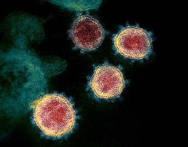
The picture here is a coloured micrograph from the US National Institute of Health (NIH). The characteristically thorny look of viruses in the corona family is apparent in this image.
The image has been coloured, an additional consequence of the aforementioned optic conditions; we are operating beneath the wavelength of visible light when we look at the corona virus. Here, there are no colours. Colour has been used to visually distinguish the S-protein from the virion’s other proteins; the purpose is in other words pedagogical rather than aesthetic.
The many faces of the corona virus
In the introduction to this text, I mentioned that we are currently communicating frequently and broadly and about the ongoing pandemic, and that visual material forms a significant part of these communications. This is borne out if you conduct a simple image search in Google for the corona virus; as can be seen in the screen-dump below, a broad spectrum of colours and shapes appear if you do so.
These images seem intended to capture the reader’s interest, but are also clearly variations on a theme: strong colours and obviously exaggerated shapes that enhance the virus’s spiky, club-like appearance.
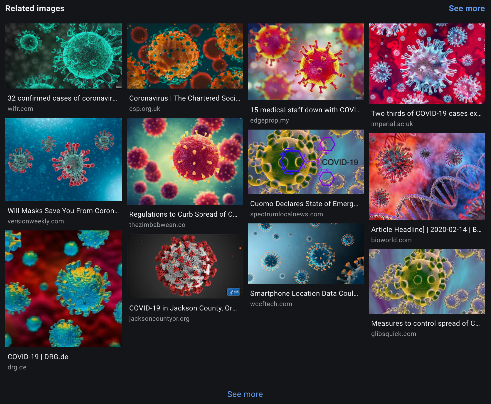
However, one of the images caught in the search engine’s net has a fairly low-key appearance in colour as well as form; it stands out a bit from the others in comparison. The image in question also happens to be perhaps the most widely spread image of SARS-CoV-2: a three-dimensional model produced by Alissa Eckert and Dan Higgins for the Center for Disease Control in the US. The image should be familiar to anyone who hasn’t been living in a cave for the past few months.
In an article for Elemental, the science journalist Robert Roy Britt has described what Eckert and Higgins’s image actually shows us. Britt points out that the colours used in the image are not "...what would appear if you could see the virus with your own eyes."
Someone else interested in how the virus is being visualized is professor Colette Gaiter at the University of Delaware’s Department of Art and Design. In an article for The Conversation, Gaiter discusses visualizations of SARS-CoV-2 from a crisis communication perspective, and calls Eckert and Higgins’s 3D-model a kind of icon that at once represents the virus and symbolizes the horror currently occurring in our communities.
Gaiter observes that though there is a great deal of variation in how the virus is represented visually, most images "...these images make the virus appear manageable. One cartoon-like image of the virus that has been appearing on Wired's website reduces the icon to something that resembles a toy. It comes from the mouth of a smiling, waving person. Again, the illustration expresses reassurance." Later in the article she notes that there may be a point to visualizing the virus in this way: "Though we don't have a vaccine, panicking accomplishes little – hence the lack of alarmist imagery. Patience is important, since cures and treatments will take time."
Yet there are images of SARS-CoV-2 that demonstrate other aspects than those Gaiter mentions in her article. Images where SARS-CoV-2 is not at all presented as a soft, manageable “toy,” where the imagery is instead characterized by aggressive shapes and intrusive colours. Sharp S-proteins threaten us; we encounter dramatic lighting and ominous colours that signal danger, or the arrival of something sick and unnatural. These are images that can absolutely be described as alarmist imagery, that is, imagery that does not have a soothing effect on us. In such images, the virus is the villain most of us experience it as, a villain we can blame the pandemic on. From an emotional perspective, imagery like this is not incorrect. From a more sober, scientific perspective, however, they simply aren’t accurate.
The untrustworthy image
Almost 100 years ago, the Belgian surrealist René Magritte made the world painfully aware of the untrustworthy nature of images when he observed, Ceci n’est pas une pipe. As Prof. Gaiter points out in her article, the same applies to the corona virus: we’re dealing with representations here – no more, no less. Choice precedes any colour, and to a certain extent any shape, that accompanies images of the corona virus, something the average Google user would do well to remember.
But how should we reason about colour and form when visualizing science on a nano-scale? Particularly if our ultimate goal is to provide as accurate an image as possible?
Open scientific resources can be utilized here to determine the shape of protein structures, something the British company Fusion Medical Animation has done with the intent of producing an additional 3D model of SARS-CoV-2. By combining three different protein structures from the protein databank (PDB), Fusion Medical Animation designers managed to create a reasonably correct representation of SARS-CoV-2, at least as regards its shape. To ensure transparency, and to the joy of all, they also provide the structures’ PDB-IDs (the protein databank’s unique codes). These PDB-IDs are connected to articles with equally unique PMIDs (PubMed-IDs), so the scientific basis for the visualization, that is, the next link in the reference chain, is immediately available.
When it comes to colour, however, things instantly get a bit more complicated, primarily because there are no real standards here, apart from the CPK-scales that apply in chemistry. Within the life sciences, flourescence is used whenever possible, but when this is not feasible or possible, a scientist is confronted with a proverbial fork in the road.
To conclude this text, let’s discuss the two diverging paths our hypothetical scientist now confronts. The first path is one we’ve already seen examples of in this text: randomly using colours to emphasize certain qualities or functions, as in the coloured micrograph above. Someone who has long wandered this particular path is the illustrator David S Goodsell. Goodsell’s artistry and manner of using colour is well-known within visualization circles; he has managed to combine scientific accuracy and rigor with an appealing aesthetic craftsmanship. The illustrations he produces, for PDB among others, are hand-made paintings in watercolour. He recently published an illustration of the corona virus, rendered in his unmistakable style, something The Washington Post’s art and architect critic Phillip Kendicott noted in an interesting article, Coronavirus is a killer. But this artist won't reduce it to a cartoon villain.
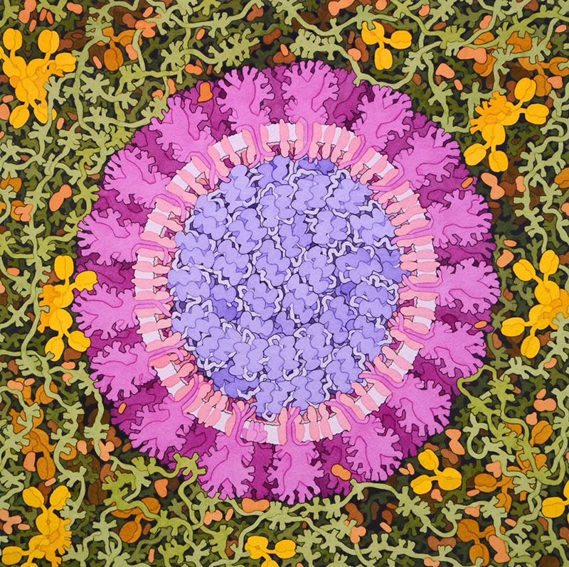
In Kendicott’s article, Goodsell describes how he reasoned regarding the choice of colours: "I did it in a colour scheme I've used throughout my illustrations, to separate the different functional parts of the image." The expression echoes an interview Goodsell gave Science in April about a year ago, another article well worth reading for anyone interested in Goodsell’s work.
The second possible path our erstwhile designer-scientist may choose is considerably more restrained, but just as percipient. The 3D graphic designer and biologist Dr Monica Zoppè, who has long made a point of not using colour in her scientific animations, is representative here. In another article from The Conversation, Molecules do not have colour!, communicator Kate Patterson argues that one should not colour what is not colourful. In her article Patterson shares Dr Zoppè's thoughts about how glossiness in a monochromatic image can be used to signal a moleule’s hydrophobic or hydrophile qualities. In other words, how structure and texture can be used to describe function or quality in monochromatic images, instead of colour.
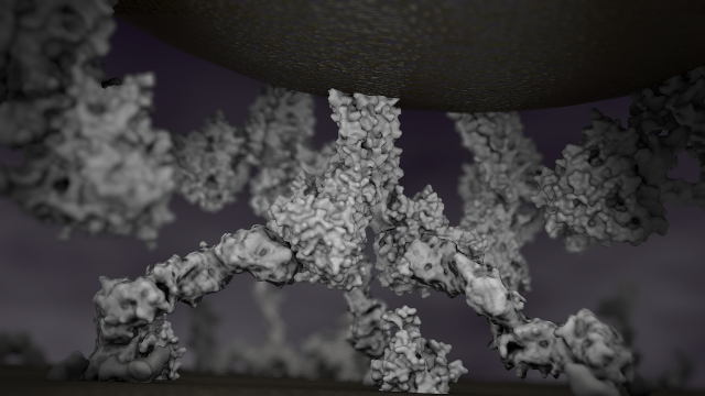
Monica Zoppè is also behind the almost 15-year-old Italian initiative Scientific Visualization, a kind of mission statement for scientific visualization on the nano-scale. On the website anyone interested in learning more about monochromatic visualization can find both several interesting articles on the topic and animations.
The organisation ACMSIGGRAPH has by the way recognized this Italian initiative, as well as Zoppè´s particular style and contributions to visualization on the nano-scale, by including a monochromatic animation in its digital exhibit, Science of the Unseen. In the accompanying article you can read, "Even for scientists, who naturally want to adhere strictly to scientific knowledge, there is always a major input of creative choice in the preparation of such animations", something which accords with this line of reasoning.
Conclusion
In a situation where reliable information is of crucial importance, it is reasonable to critically examine visual as well as verbal material. Communication in a crisis age is sensitive, and as we have seen here, images speak to us not just intellectually but immediately and emotionally.
How media works is one thing, but within the frame of scientific communication transparency matters, as does an obvious and unbroken chain of reference. The method used by for instance Goodsell, Zoppè and the designers at Fusion Medical Animation, is not only good scientific practice, but the foundation for all scientific communication. It is also an approach that contributes to the spreading of vital knowledge, rather than opinions or emotions that may cause people to act irrationally.

If you would like us to get back to you, please submit your contact information in the form below along with your feeback.