Poster design
Your poster is an advertisement for your research and as such it needs to be eye-catching and straight to the point. You only have seconds, or at best a few minutes to attract the attention of the visitor to a poster session.
Poster templates
Bildmakarna provide a poster template in PowerPoint that you can download and edit. The template is designed in compliance with KI's graphic profile.
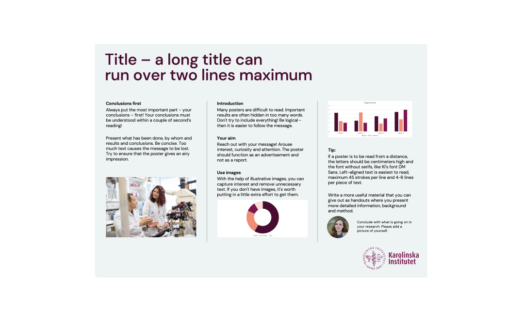
Poster template PowerPoint, horizontal
Download PowerPoint template for horizontal posters, A0 119 x 84cm, in line with KI's graphic profile.
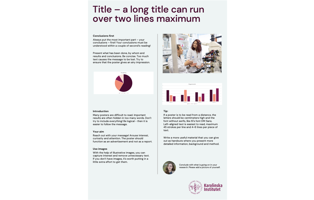
Poster template PowerPoint, vertical
Download PowerPoint template for vertical posters, A0 84 x 119cm, in line with KI's graphic profile.
Draw attention
Keep your message short and clear. If you succeed in getting the reader's attention, then chances are that you will be able to provide her/him with more detailed information in the form of handouts or QR codes with more info. If you fail to attract the visitor’s attention, then it does not matter how interesting your research may be, since the visitor will never know about it.
Your main message
Keeping your message clear and your text concise is the hardest part of poster design. You have probably spent years on the research behind the results you want to present and have long descriptions of your methods and conclusions accompanied by illustrations all of which you want to present in your poster. However, the chances are that you have far too much for a single poster.
You will need to learn to be ruthless in deciding what is relevant for this poster and getting your message across to your target group. Get an outsider to take a look at your poster – if they are unable to get your message within a couple of minutes then the chances are that you need to redesign your poster.
Common errors in poster design
- Trying to convey too much information at one time
- Too much text, too many words
- Too long title
- Too few illustrations
- Too small typefaces
- Too much details in graphs and diagrams
- Too strong colors in the design
- Too strong borders surrounding text boxes
- Too small margins in text boxes
- Too little white space between text blocks and illustrations
- Non-logical presentation of results and parts in the research process
As you can see, the majority of the errors in poster design are caused by trying to squeeze too much information into one single poster.
Planning
Here is some practical advice on what to consider before you begin to design your poster.
Consult the organisers' instructions
Check the organisers' instructions to determine the exact size and format for the poster. It is important to know whether an allocated area of 1.50 m * 1 m is in a landscape or a portrait format. Landscape format is definitely preferable since most of your poster will then be at eye-level.
It is a good idea to get the poster number from the organisers beforehand so that you can print it on the poster.
Allocating your time
As with most things, preparing a poster will take as much time as you let it. However, as rule of thumb, if you have little experience of making posters allocate at least a week.
A good way to do the time planning is to start with the due date and work backwards to set up some deadlines. This is especially important if there are several authors involved in the poster production.
Remember to leave some time for review, editing, and last minute corrections.
Allocate at least a day for the printing process. There is always something that can go wrong so do not wait until the last minute even if you do not anticipate any difficulties.
Transporting your poster
Think about how you are going to transport the poster to the conference. Are you going to fold it or roll it?
If you use a professional printing agency, as Bildmakarna, they will supply you with a handy tube for the transportation of the poster.
Backup
Remember to allow time to make a backup copy of your poster. Keep a copy of the content on a cloud-based service easy to reach.
Handouts
Sometimes it's appreciated to provide handouts to your potential readers. It should include a miniature version of your poster and more detailed information about your work, in an illustrated narrative form. You want people to remember you and your work!
Planning content
You should always make a sketch of your rough plans for how the poster will be laid out on paper before you begin your work on the computer. This will help you to focus on the overall presentation first, before you get into the detailed work of designing your poster piece-by-piece.
Don't forget the general design principles of including white space, keeping lines and colors understated, avoiding distortions, explaining and annotating, and trying to make every mark contribute to telling your story.
Now it is time to get down to the nitty-gritty and decide what to put on your poster!
Audience
Who will be your audience at the conference where your poster will be displayed? Are they experts or novices? Adapt your information to your target audience. If they are specialists it is permissible to use technical jargon or acronyms, but if you have a general audience you should try to minimise or eliminate jargon and use more commonly understood terminology.
Abstract
In most cases organizers require poster presentations to submit an abstract prior to the conference. This abstract should tell readers why your work is important, your methods and your conclusions. Your abstract can serve you as an outline for your poster whereas your poster could be considered an illustrated abstract.
Synopsis
Start by thinking of your poster as an advertisement for your work rather than an opportunity for a complete presentation. A poster is not meant to be a scientific article and you should not try to put all the content of an article onto a poster. Detailed background material can be supplied in handouts.
A good poster needs to be both eye-catching and informative. For a scientist this may seem somewhat populistic, but remember that if you are not seen, you are not read. Your goal is to get visitors to stop at your poster.
Start by determining the main message you want your poster to convey to your audience. This message should be stated in one or two sentences. You can also choose to design your poster to address one central question. In this case, you should state the question and the answer clearly on the poster.
Because a poster is primarily a visual presentation, try to find ways to illustrate your methods and results with pictures. Use images, diagrams, arrows, and layout to direct the visual attention of the viewer, rather than trying to explain the message by using text alone.
All illustrations and text used on the poster should relate to the main message of the poster in some way.
Evaluate and edit
Evaluate your work by using a 60 second evaluation. If you don't get the message in a minute, you will have to redesign the poster. Even better, let an outsider not familiar with your research be your guinea pig!
Remember that there is almost always too much text in a poster. If it is not relevant to your message, then out it goes!
Have your colleagues comment on drafts. Print small versions and circulate for comment. It's useful to get feedback from your classmates and professors, as well as readers from other disciplines.
Seek assistance from your supervisor in designing and proof-reading your poster.
Content checklist
Make sure that your poster clearly illustrates:
- The title of the work
- The name of the authors
- The topic
- Why this is important research
- The research you have completed
- Your conclusions
Layout
Posters are primarily visual presentations. Your poster should be dominated by self-explanatory illustrations such as graphs and pictures while the amount of text should be kept to the minimum. Your texts are there to support your illustrations. The conclusion or the abstract is usually the only place where full sentences should be used.
A balanced and good-looking poster usually has about 40% graphics, 20% text and so much as 40% empty space. This is because empty space between poster elements can be used both to separate them and group them together, instead of using borders.
Use a logical structure and a column format and label or number subsections in columns so that the reader can navigate the contents of your poster more easily.
Make all visual aspects of the poster large enough to view two to four meters away and make the text easy to read. This includes large text, enlarged photos, simplified graphs and charts, and simple drawings.
Format
It is generally preferable to use a landscape format rather than portrait format when you design a poster, since then the reader will have a larger percentage of the poster area at eye-level, which makes reading and interpretation both easier and more comfortable.
Sequencing contents
Determine a logical sequence for the material you will be presenting and arrange the material into sections that eventually will end up in poster columns. For clarity, present the information in a sequence that is easy to follow. It is usual to arrange the contents of the poster in a series of three to five columns. This will facilitate the flow of reading the contents of your poster.
It is common to use numbering of elements to facilitate the readers’ understanding of the presentation, but it is also possible to use white space creatively to indicate the flow of information.
Put the most important part of your message first. Usually, this is the conclusion. The best place for the conclusion is thus in the upper left-hand corner of your poster.
It is recommended that you place the elements of the poster in the following positions:
- The title across the top
- Authors and affiliations below, across the top
- A brief introduction with conclusions in the upper left hand corner
- Methods and results will fill the remaining space
Paragraph format
Use left aligned text. Justified text with straight margins may look nicer at a distance, but is more difficult to read.
Use a maximum of 35-45 letters per line (including spaces) and no more than 6 lines per paragraph.
Text size
Posters should be readable from a distance of about two meters. This is to prevent crowding around small print which can discourage others that are interested. Therefore, all text should be printed with letters at least 1 cm high that can be easily read from a distance of two meters while standing.
Fonts
The best font for text blocks that are as short as they should be on a poster is a Sans Serif typeface family. Therefore, use sans serif fonts such as Arial or Helvetica, rather than serif fonts like Times or Courier. (Serifs are small hooks on the letters that support the eye when reading longer texts.)
The use of several different font faces in a poster can distract from the content. Choose one or at a maximum two fonts and then use them throughout the poster. If you decide to use two fonts, the use of san-serif fonts in headings and serif fonts in paragraphs is a classical combination. But it can also be done vise versa with serifs in headings and san-serifs in paragraphs.
AVOID CAPITAL LETTERS IN TEXTS THAT ARE LONGER THAN ONE LINE, SINCE THEY ARE MORE DIFFICULT TO READ. (As seen from this example.)
Colours
Do not distract the reader with too many colours. Choose a colour scheme with 2-3 colors, and use it consistently. If you use too many colours the reader will assume that you have used these colours for a reason and will read meaning into their use. Too many colours can also detract from the message your illustrations are meant to convey.
Use high contrast between text and background colour. A recommendation that you may wish to follow is to use a light pastel coloured background, for example beige or gray, to unify the look of your poster.
Avoid a dark background with light letters. Neither should you use red and green next to one another or red text on a green background (or vice versa), since a fairly large number of people are red/green colour blind.
Be warned! The colours that you see on your monitor will not reproduce exactly the same on the printed poster and will differ from your proof print. In particular, many of the blue colours will print purple.
Borders
Use dark or black borders with caution. Highlighting texts and illustrations, by putting a border around every block of text and every illustration means in effect that nothing is highlighted.
If you decide to use borders, be sure to leave wide enough margins between the text content and the borders, otherwise the text blocks may crowd your text into oblivion.
Highlighting
Use highlighting techniques sparingly. You may emphasize text by using bold or italics, but do not use underlining since it reduces readability.
In some cases you can use enlarged or colored text to emphasize particular points on the poster. However, this is only effective if you keep this method to a minimum.
Text elements
Poster title
Choose the words for the title particularly carefully. Your title should be short but reveal some of your results or your conclusion.
The title should be readable from a distance of 4 - 6 meters, which means that it should be about 4 - 5 cm tall. That is about a 96 point size, or 48 points enlarged by 200% when printed. If the title words are well chosen, they will attract viewers closer to read more about your work.
If you have to create a title longer than one line, use lower case letters which are easier for the eye to follow.
Determine if you will justify the text of the title to the left or center it once the rest of the poster has been formatted, based upon personal preferences and space constraints.
Authors
Ensure that the authors' names are smaller than the title since these do not need to be seen from a distance. A good size is 72 points, equal to 2.5 – 3.5 cm when printed. Use boldface and mixed upper/lower case for the authors names. It is also recommended that you use full first and last names, especially if you will be standing by your poster. This makes it easier for attendees to talk with you.
Titles of authors are usually omitted on a poster.
Authors' affiliations
Try to group authors' names and affiliations, so that attendees can easily identify who comes from where.
Affiliations can be even smaller, at about 36 - 48 points (0.5 - 0.75 inch). Use plain text, no boldface, and mixed upper/lower case for affiliations.
Poster number
The poster session number should be printed separately, at about 96 point size, boldface. It typically is placed in the top of the title banner, to the left, right, or at the center.
Conclusions
Place the conclusions in the upper left hand corner of your poster. They should be one of the first things a reader sees. Your conclusion must to be understood within a couple of second's reading!
Prepare your conclusion with the reader's perspective in mind. What was done, by whom? Avoid using passive tenses; use an active voice when writing your text.
Body text
Here is some advice on how to present what you have to say - what to say first, text size, fonts to use, paragraph format and how much text to use.
The body text of the poster should be readable from about 2 meters away. Use about 1 cm height for letters which is readable from a distance of about 2 m. For section headings (e.g., Introduction), use boldface, maybe about 32-36 points. For supporting text (e.g., text within each section & figure captions), use about 22-24 point (boldface, if appropriate).
Use left aligned text in your paragraphs since it is easier to read. Center alignment produces ragged left and right edges. This makes reading the poster more difficult.
Use an active voice when writing the text and try to limit your whole poster text to 250 words. Delete all references and filler phrases, such as "see Figure..." and try to use illustrations and figures to make your point instead of words. Use phrases rather than full sentences.
Avoid using abbreviations except for standard forms like m, kg, h, and yr. Abbreviations that require explanations make reading more difficult. Never use any special abbreviations you have created for your study.
Keep text elements to 50 words or less. Divide your text in blocks of about 5 rows and 40-50 letters in each row.
Use bullets to break up blocks of text that tend to get lengthy.
References
Include references on your handout instead of your poster.
Illustrations
The success of a poster largely depends on clarity of the illustrations and tables that you use. Self-explanatory graphics should dominate your poster with a minimal amount of text materials acting as a supplement. Do not be afraid to use drawings since they allow you to bring out the important details of what you want to show, sometimes better than photographs.
As a rule of thumb, illustrations should be easily legible from a distance of two meters. Figures created for articles are made to meet the requirements of scientific journals. If you intend to use these in your poster you will probably have to revise, and possibly edit, these figures to make them comprehensible in your poster.
Illustrations should be of sufficient size to be visible from a distance – 8 cm x 8 cm photos are probably the smallest to use, and 10 cm x 12 cm photos are a good size. Drawings are best if at least 20 cm x 24 cm. The advantage of using these sizes is that they are standard paper sizes and are compatible with many computer generated programs.
Using more than 3 or 4 figures may indicate that you are trying to say too much with one poster.
Be sure to get permission if you use someone else's illustrations and acknowledge them on the poster.
Graphs and tables
Don't reuse graphs and tables from your article for your poster without editing, since they probably contain too much detail for a poster. Remove all non-essential information from graphs and tables (as data curves not discussed by the poster and excess grid lines in tables).
Label data lines in graphs directly, using large type and colour. Eliminate legends and keys. Use contrast and colors for emphasis. Use colorus to distinguish different data groups in graphs, but be aware of the potential problem for colorblind people using red and green colours to convey different information. Avoid using patterns or open bars in histograms.
Stick to simple 2-D line graphs and avoid 3-D graphs. 3-D graphs may look nicer, but tend to carry lot of image layout that does not add any actual information to your message.
Coloured transparent overlays are also useful in comparing/contrasting graphic results.
Figures
Figures are the best way to present data since figures are easier to comprehend than tables. Try to make your figure as immediately self-explanatory as possible and reduce the amount of data to the absolute minimum necessary to support your conclusions.
All labels should be horizontal and legible from a distance of two meters. Vertical labels should not be used in your poster. Label directly on the figure and try to avoid using a special box for legends. Do not use "see Figure 1" in your text or number your figures.
For line graphs, emphasize data points and minimize the connecting lines. Use distinctive bars and limit the size of borders for bar graphs. Use contrasting colors or patterns for adjacent sections of pie charts.
Photos
Planning is essential if you intend to include photographs.
Do not import pictures from web sites since their low resolution only makes them suitable for on-screen presentations and web page use. If used for 35mm slides or posters they will appear fuzzy looking. Pictures for use on a poster should be scanned at 150 dpi at 100% of the size they will be used on the poster. If designing at 50% scale (ie: 18x30 for a 36x60 poster) then scan at 300 dpi. Save the image as a high quality JPEG file.
Colour can enhance the hues or contrast of photographs: Use a light background with darker photos; a dark background with lighter photos. Use a neutral background (gray) to emphasize colour in photos; a white background to reduce the impact of colored photos.
Poster sessions are often held in rooms with harsh fluorescent light. If exact colours are important, balance those colors for use with fluorescent lighting. Note that colors will be intensified by fluorescent light; bright (saturated) colours may become unpleasant to view.
You may need to edit or crop photographs so that the crucial aspects will be obvious to the reader. Use sufficient enlargement to allow details to be seen at a distance of two meters.
Use coloured arrows or circles to point out essential details.
Photographs must have a short, clear title so that a reader will immediately understand what is being shown.
Tables
Try to avoid using tables on posters since they generally require too much attention and concentration from the reader.
Captions
Make sure that every figure, table and picture has a caption that describes what is being shown. All text should be horizontal, not vertical.
Software to create your poster
On the page Resources for visualisation, you get suggestions on software to create your poster in, most common might be Microsoft PowerPoint.
Print your poster
Bildmakarna at the library can help you print your poster, read more at Order a production from Bildmakarna.
We print posters in full colour up to 150 cm wide and unlimited length on various materials (large format prints and poster prints).
In addition to ordinary poster paper, we can also write on, for example, canvas and textiles.
Order a design for your poster
If you don't want to design your poster yourself, you can hire Bildmakarna to design your poster for you.
Bildmakarna offer customised graphic design services for clients needing specialist help to produce scientific posters. Send us your files – including text, graphs, tables and figures and we will design your poster in PowerPoint.
Contact
If you would like us to get back to you, please submit your contact information in the form below along with your feeback.