Accessible visualisation
Visualising accessibly employs a combination of several different communication principles. The primary one is basic accessibility, but to this we might add additional principles, such as clarity and transparency, the hobbyhorses of scientific communication. Another concept of significance is narrative, or storytelling.
Upcoming events about visualisation
- 2026-02-17 - 12:15
- 2026-03-02 - 12:15
- 2026-03-18 - 13:00
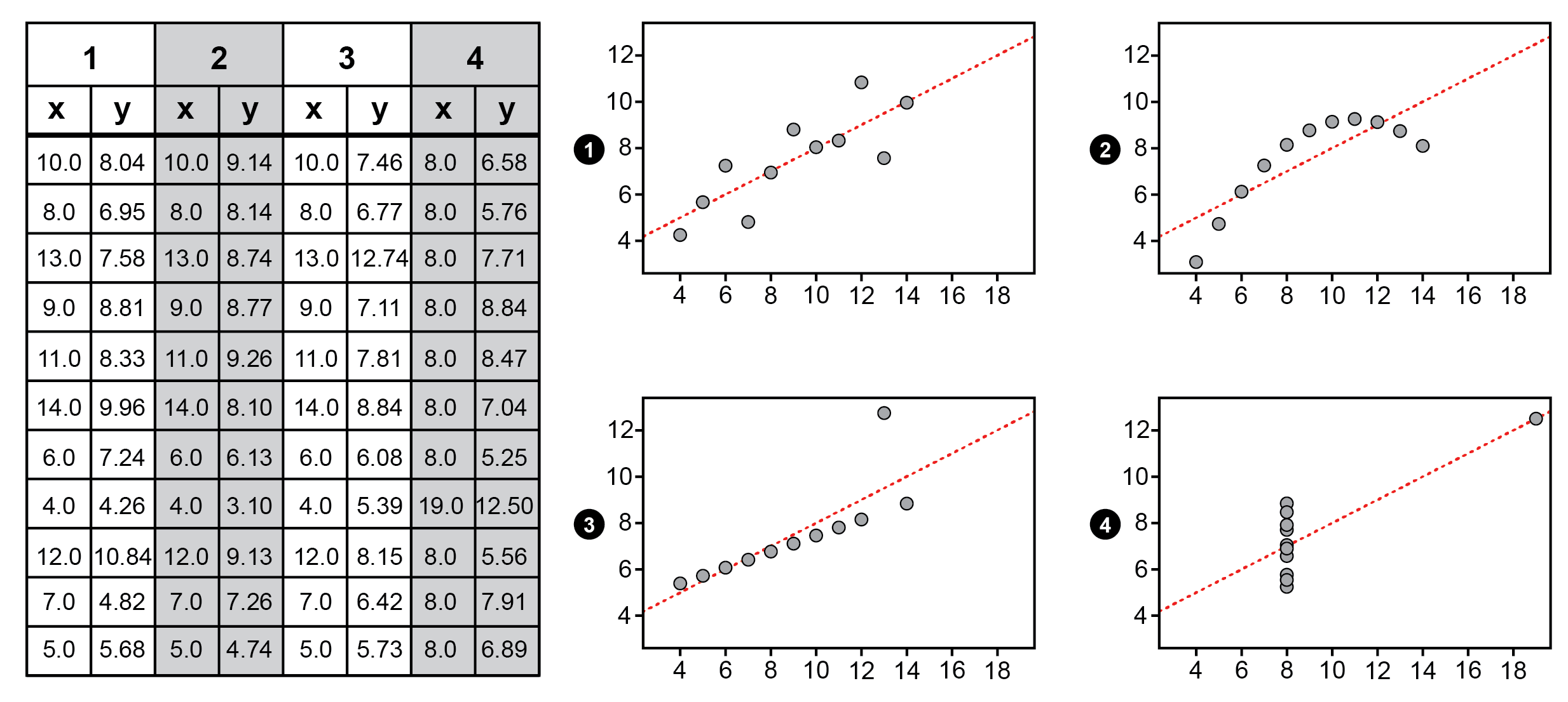
Ensuring that your message can be received by as many viewers as possible is an important part of the visualisation process. In fact, one might argue that data visualisation is, in itself, accessibility. Let's take "Anscombe's quartet", which is often used to describe the importance of visualising data, as an example. Exploring and understanding the patterns in its four data sets by only looking at the tables, calculating and comparing numbers is not very straightforward; it requires both time and mental effort. When the same data is instead visually encoded and visualised through graphs, however, the patterns hidden in the data instantly becomes much easier to grasp.
Any visualisation published online must meet basic criteria for accessibility, including alt-texts, subtitles and maintaining colour and contrast. A common mistake is to convey important information using colour alone, and forgetting to take into account those viewers who perceive colour differently. Closely related to a restrictive use of colour is ensuring that you do not overwhelm your viewer. You don't want to emphasize everything all the time; you want to protect and direct the viewer's attention carefully and make sure that the message central to your visualisation is the one that stands out. In the University Library's open online course about visualisation we provide case studies and exercises that can help you improve the accessibility of your visualisations.
- Impairments, disabilities or variations do not necessarily mean chronic conditions or constant circumstances. Blindness, for example, is a chronic condition, but having temporarily reduced vision due to unfavourable lighting conditions, or a medical condition, is not. It is also not an absolute; no person is blind in the exact same way as another. There is a spectrum.
- Start thinking early in the visualisation process about how you might ensure that the message communicated in your visualisation is accessible to as many viewers as possible, no matter their disabilities, impairments, or variations thereof.
Keep in mind that accessible visualisation means more than adopting a norm-critical and inclusive perspective during the production of graphic material. It is also about transparency, that is, demonstrating through references what kind of data or information you have selected and based your visualisation on, as well as what has been excluded and why.
Storytelling is about making your research more accessible to your audience by letting your visualisation tell a story, and not just describe objects. Although it may feel out of place to apply classic storytelling elements directly to scientific communication, here are some examples of basic ways to use storytelling when presenting your data and findings:
- use visualisation to reveal and highlight new or surprising aspects of a particular phenomenon or its relation to other phenomena,
- establish a clear reading order and visual hierarchy; this will make it clear to your audience where and how to enter your visualisation, and where to go next,
- use examples or analogies; this can illustrate and explain a piece of information in a more varied, understandable, relatable, vivid and memorable way.
Learn more

Self-paced course on visualisation
The University Library’s free, open online course on research data visualisation provides you with a basic introduction to the field. Through case studies and practical exercises, you will learn to graphically represent and communicate data in an effective and accessible way.

Contact the library
You are welcome to contact us through phone, chat or email.
Opening hours chat & phone
If you would like us to get back to you, please submit your contact information in the form below along with your feeback.

